Time Fairy
Time management is a critical executive functioning skill that many of us find challenging for an array of reasons.
The goal of the Time Fairy app, is to provide an intuitive way to track activities throughout the day, and allow sharing with an action partner or mentor.

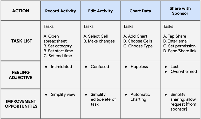
User Journey
U.A. provides a template for time tracking, but using spreadsheets can feel overwhelming, and discouraging.

Lo-Fi Prototype
Figma was used to create a low-fideltiy prototype used for a usability study with several tasks.
- Sign into app using Google
- Start tracking an activity with category & subcategory
- View activity charts
- Disable sharing [with old mentor]

Mockups
A design system and style guide were created to lay a foundation for creating responsive designs for web, and native mobile designs.
While typography and controls were mostly shared across designs, differences include:
- Top navigation is only fully displayed on large screen
- Bottom Nav on Native Mobile
- Heading row only on web; Native Mobile highlights area at Bottom
- Large deskop size allows space for labels to surrond chart

Hi-Fi Prototype
Figma was used to create a high-fideltiy prototype used for a usability study with several tasks.
- Sign up using Google or Apple Id
- Starting, stopping, and restarting time tracking
- Drill down from Category Chart to Subcategory charts
- Send invitation to view activity data via email or SMS
Takeaways
Time Fairy was my capstone project for the Google UX Design course. Time Fairy was well received in usability studies and it felt rewarding to be designing an app for social good.